Be warned, this harkens back to a time when computer monitors were cathode-ray beasts, floppy drives proudly stored your data, 1.44 MB at a time. I suppose you could call this my wayback machine.
Unfortunately, many of my projects for IBM were for RFPs and executive presentations under NDAs, so are not included here.
The company had a very strict set of brand standards, even for internal and private communications and part of my role was to act as one of the gatekeepers of those standards, for myself and others in the department. At the time, fonts were limited to Bodoni and Helvetica. IBM has since also adopted Lubalin Graph and Janson, to update and temper their corporate image while maintaining a professional appearance.
These designs are of course dated and very corporate, but in keeping with the trends (and my experience) at the time.
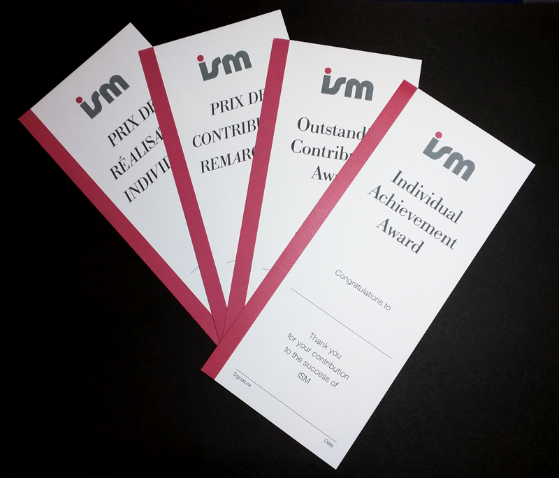
Awards certificates for employees
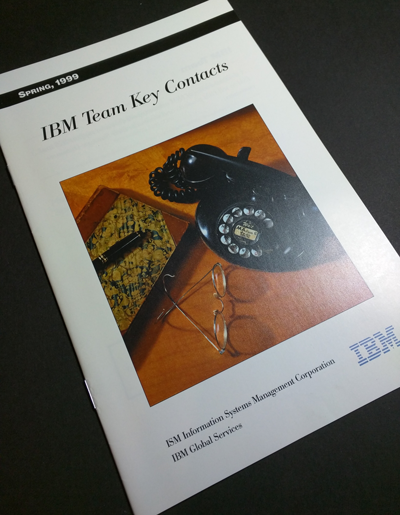
Many internal reference booklets needed to be created on a regular basis.
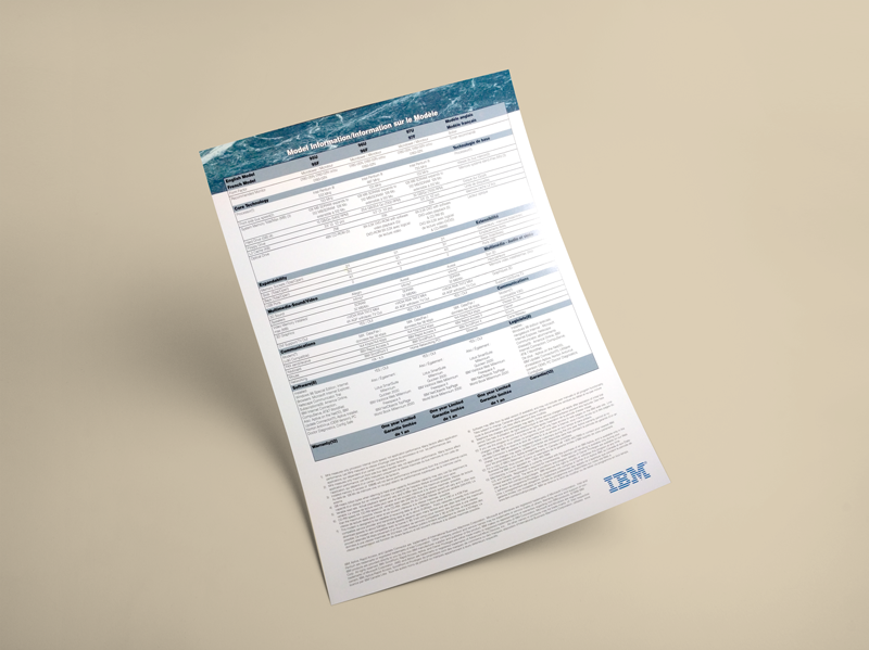
These tear sheets were the backbone of conventions and showcases for IBM’s hardware sales. There were many variations, and most contained French and English copy.
The reverse side showed detailed technical specifications. My design challenge was simply how to include this weight of information while keeping the design clean, readable, and crisp as a pressed white shirt.
Occasionally, logos were created for new services or departments.
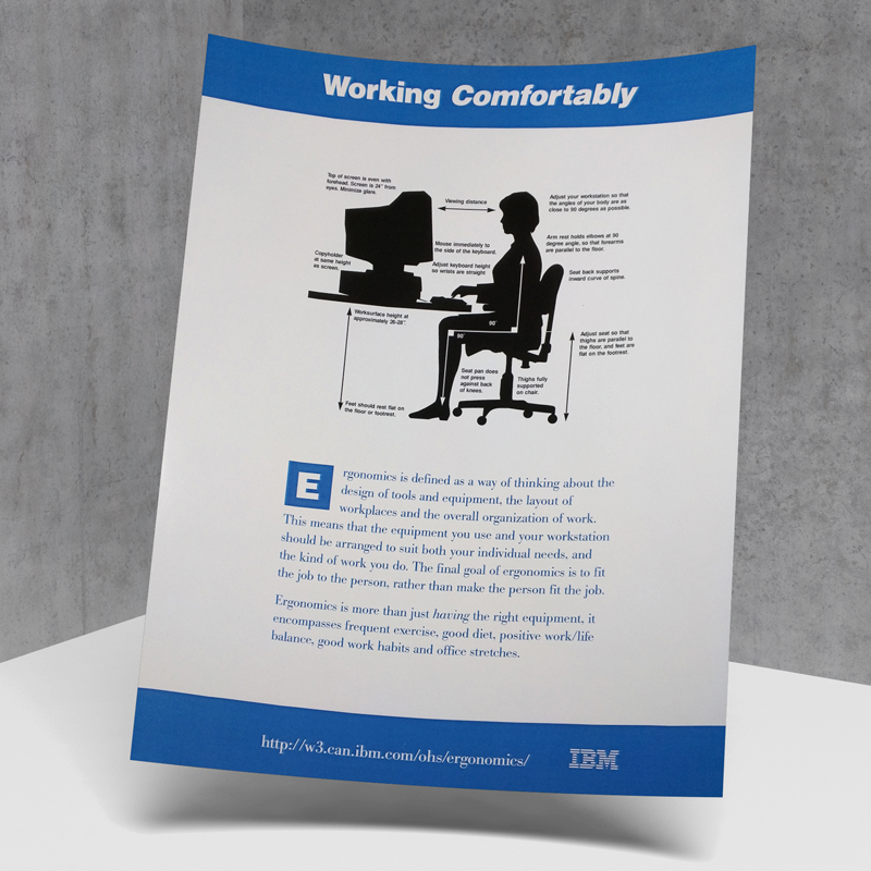
Ergonomics were of paramount importance to cubicle jungle denizens, so posters and flyers like these were often needed. I worked with the client (Office Health and Safety) to illustrate and design this series of posters and handouts.
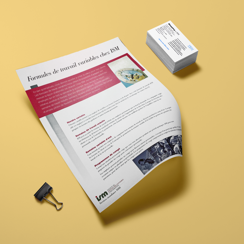
HR policy information sheets, in multiple languages.